


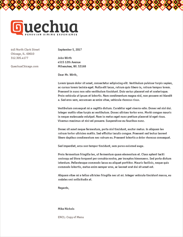
Quechua Peruvian Restaurant
I sought to create a brand system for a fictional restaurant called Quechua, a moderately-upscale “dining experience” specializing in Peruvian cuisine. It would be located in the River North neighborhood in downtown Chicago. The brand characteristics would be playful and authentic to Peruvian culture, borrowing from the region’s bright patterns, unique landmarks, and geology.
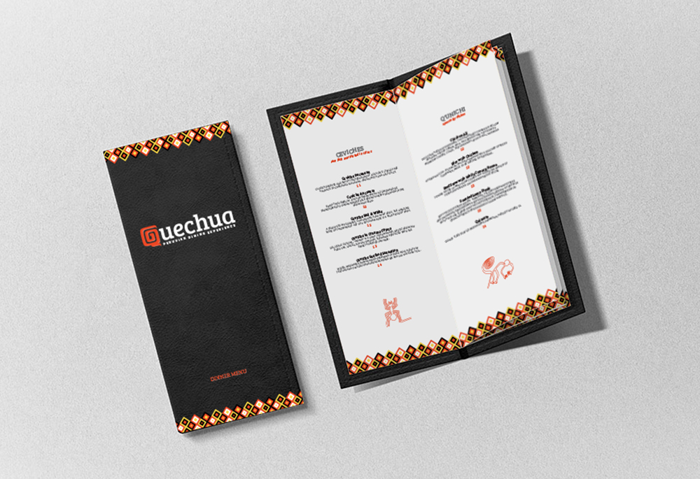
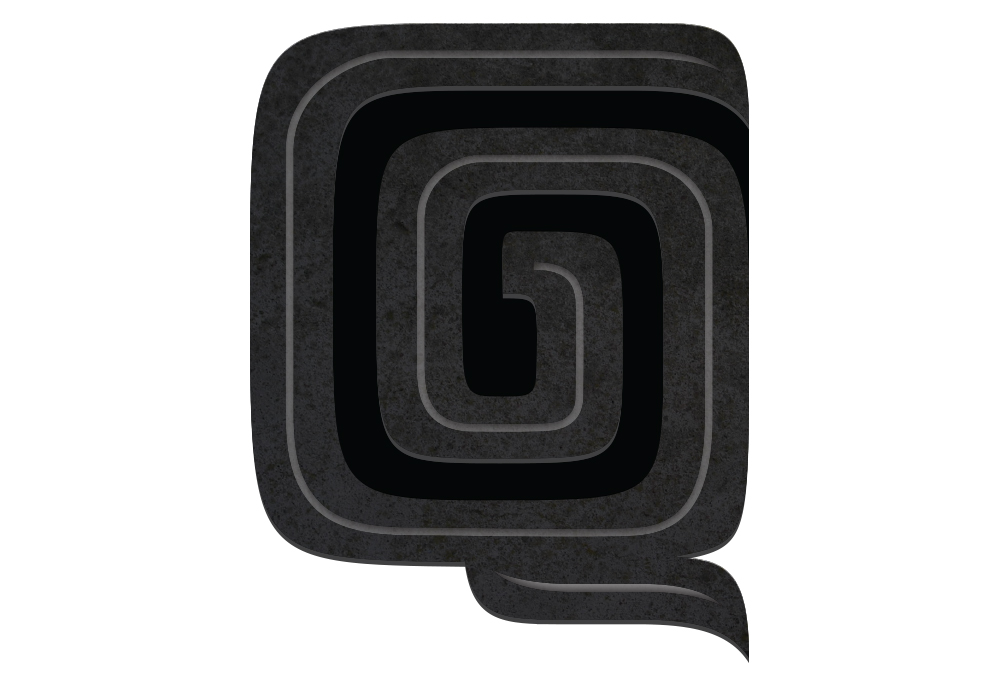
The name Quechua is in reference to the native languages of the indigenous peoples of Peru. The logotype’s vibrant red “Q” spirals inward, referencing Peru’s famous Nazca lines, giant geoglyphs in the southern desert of the country. Replications of these Nazca lines are found adorning the pages of the leather-bound menu. In an effort to develop a guest’s knowledge of the culture their meal comes from, the menu’s titles are in the Quechuan language.
In contrast to the diamond pattern motif, custom-cut stone coasters would be created from Andesite, a dark gray volcanic rock found in southern Peru. This material is specifically chosen in reference to the Ica Stones, ancient rocks with carved illustrations of dinosaurs and advanced technology.
At the end of the day, diners at the Quechua Peruvian Dining Experience would leave with a belly full of ceviche and the knowledge of this beautiful and ancient region of South America.